Overview
American Airlines, a leading force in the airline industry, serves a diverse clientele,
including business professionals, frequent flyers, families, and international
travelers.
With a commitment to efficiency and comfort, it remains a preferred choice for a broad
audience seeking exceptional travel experiences.
This is a UX/UI audit evaluating the user experience of the flight booking process
within
the mobile application. The goal is to solely:
- Identify existing opportunities for UX improvement during the booking process
- Propose redesign solutions
Process
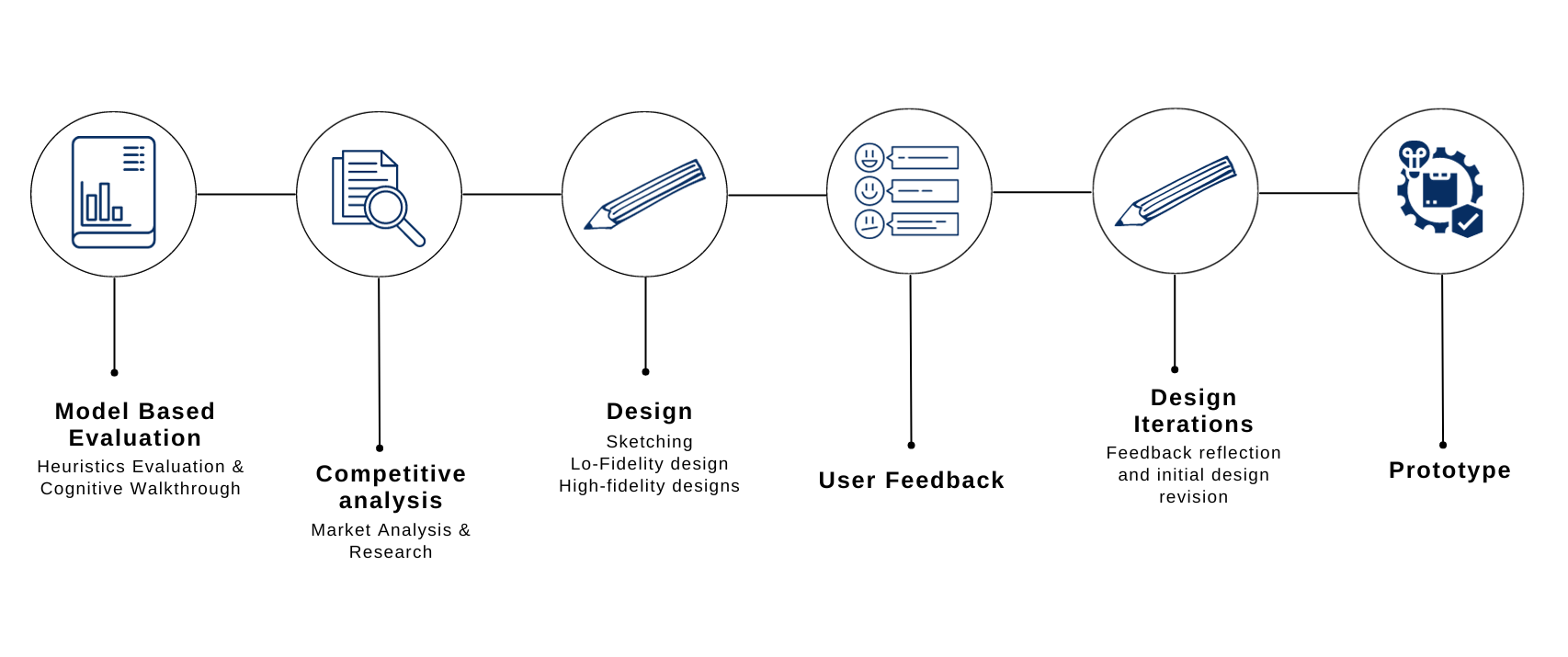
Heuristic Evaluation
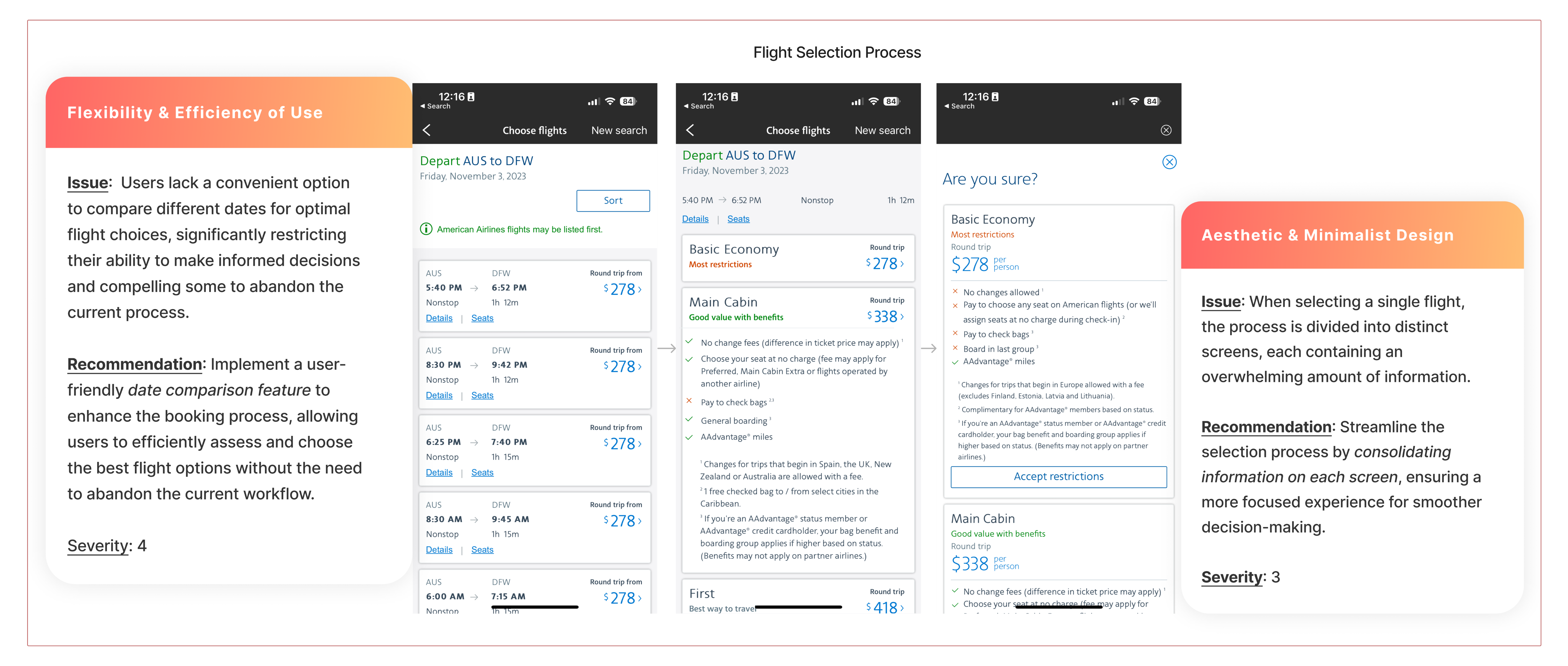
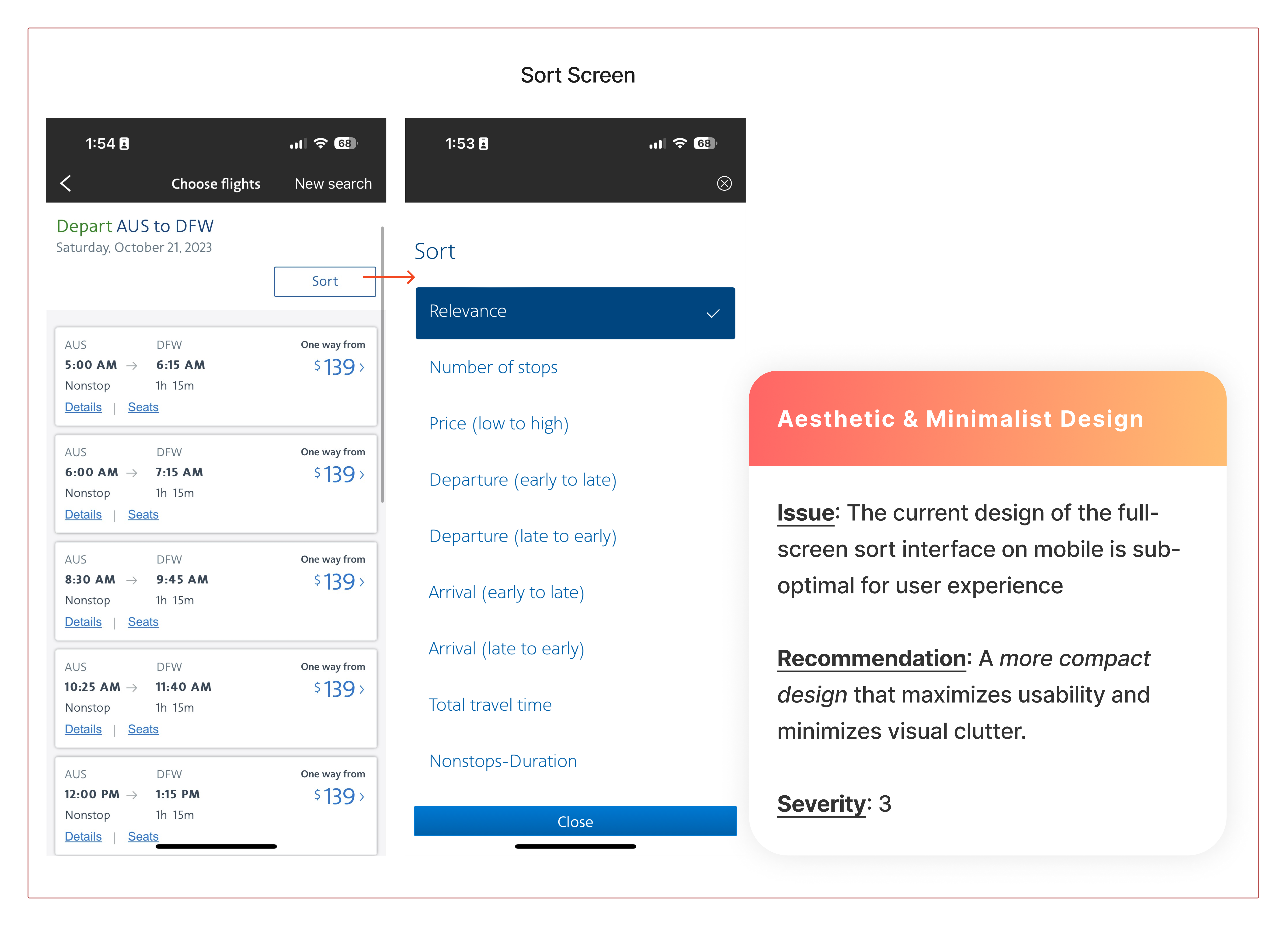
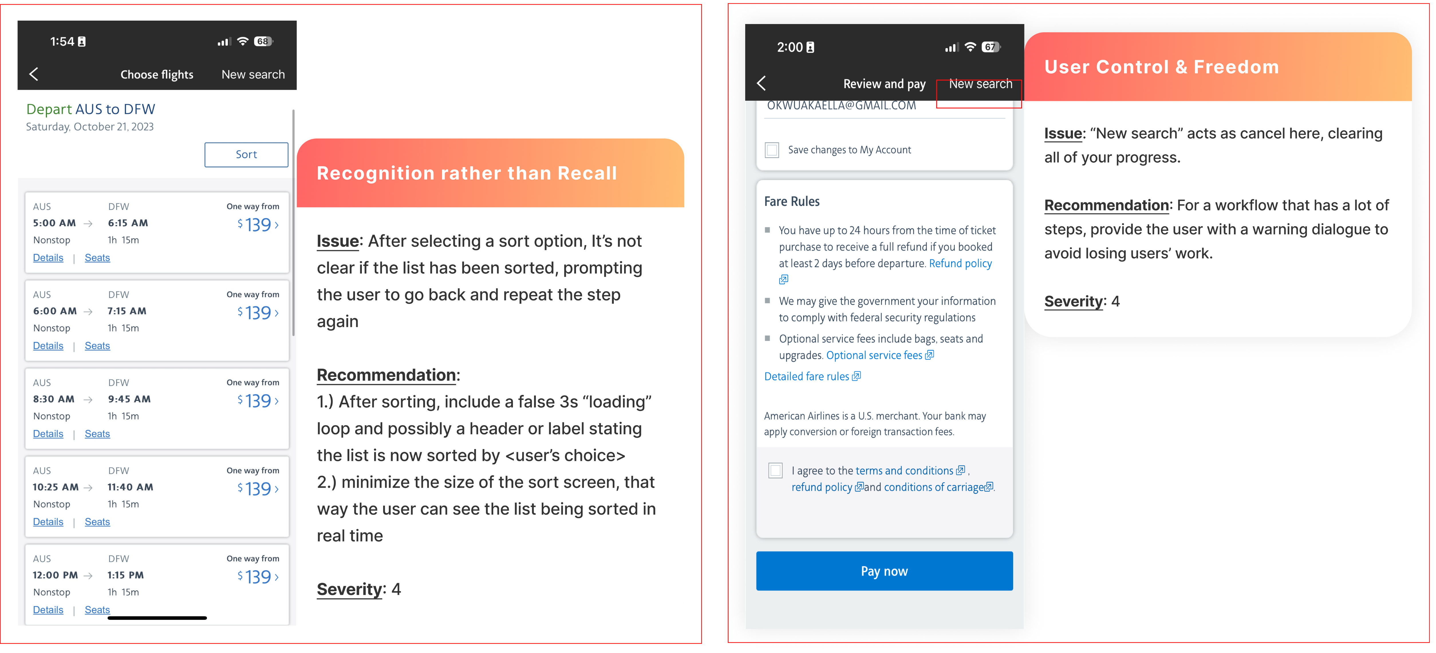
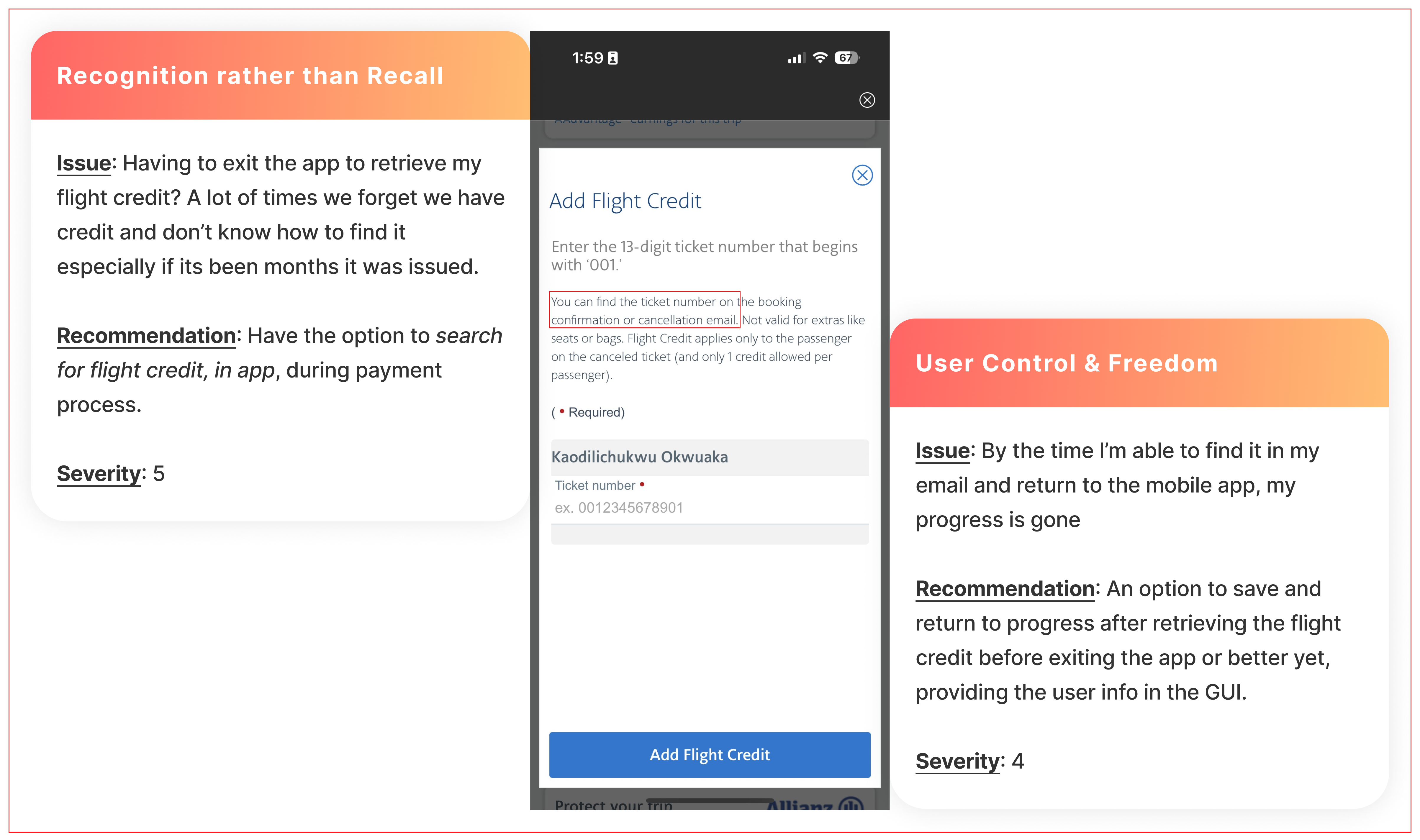
I started off by conducting a heuristic evaluation of the mobile application using Jakob Nielsen's Ten Usability Heuristics to get an understanding of the overall usability. Following my evaluation, I decided to prioritize solving the following issues as they were the most severe for users during this process, and considering the limited time constraint I was working under.
Flexibility and Efficiency of Use | Aesthetic and Minimalist Design
Recognition rather than Recall | User control and freedom
Visibility of System Status
Overall the process for booking a
flight is a
multi-step
flow, however the system leaves end users without a clear understanding
of the number of steps involved. From my research, this leads to frustration and
users abandoning process halfway.
Recommendation: Including a progress bar will tremendously improve
this issue.
Design Iterations
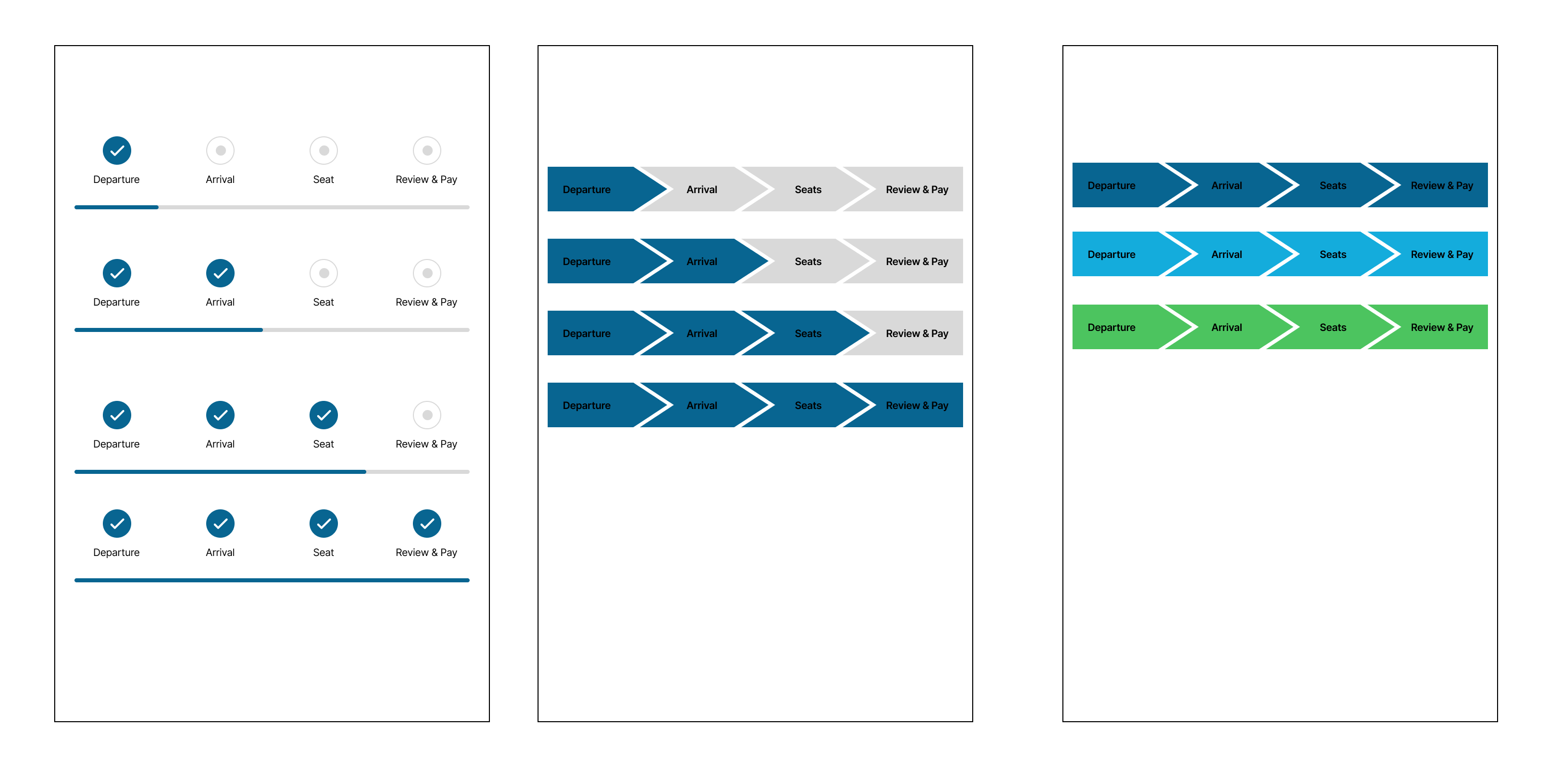
Following my analysis and assesment, I started exploring designs for the
progress bar. The progress bar was an important component for this redesign as it
was
going to be integrated into every page of the mobile app. Because of this, I had
multiple iterations
of it to make sure it blended seamlessly.
Although Option 1 offered a neat design, I chose Option 2 for its
precision,
given the density of existing information on the screen.
Interestingly, one of my user feedback comments mentioned
that Option 2 resembled an airplane, aligning well with the theme :)
For my color choice, I adhered to the brand's primary blue palette, briefly
exploring
green for its association with progress, but it didn't blend effectively.
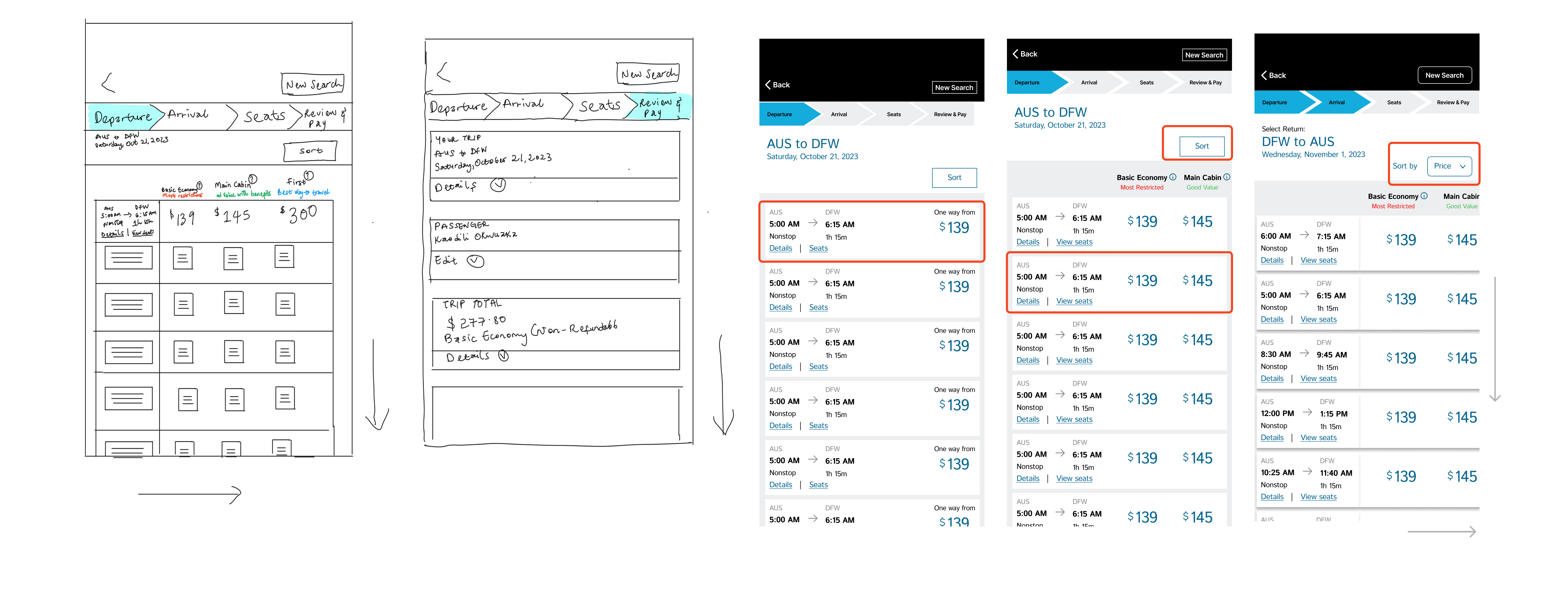
For the overall redesign, I worked through different versions of each screen, considering feedback from users and comparing it to other airline booking systems. During my competitive analysis, I noticed most booking systems have a single page for listing different flight tiers, making it easy for users to get a quick overview and decide quickly. However, with American Airlines, it takes a few steps to access information about other tiers. Here are some sample iterations of how the design evolved showing new sort button and direction flow of information.
Prototype
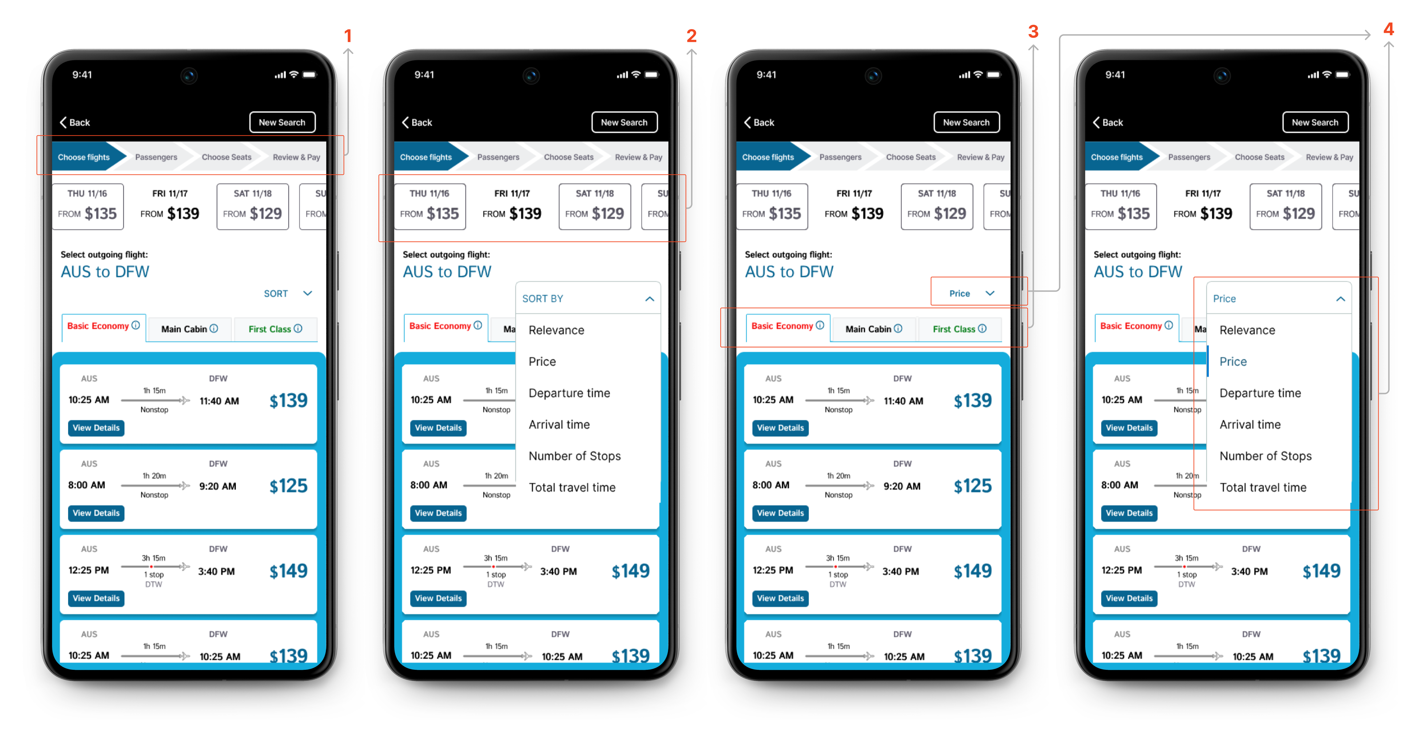
Further researching other airline booking systems and going through different iterations, I arrived at this.
- I integrated a progress bar to give users a visual indication of their progress, enabling effective communication and visibility, as well encouraging completion of the booking progress.
- Additionally, I introduced a horizontal scroll section that provides a comprehensive overview of prices for the preceding and subsequent days, facilitating seamless price comparison. This section also includes a user-friendly option to effortlessly modify the initially selected date.
- Applying Hick's Law, I streamlined the user experience by simplifying the visual presentation and minimizing the steps required to explore different tiers (Basic Economy, Main Cabin, First Class) through a tabbed menu , ensuring essential information is maintained
- I reduced the size of the 'sort screen' and implemented a visual cue to inform users about the sorting action by displaying the selected option after the action is completed.
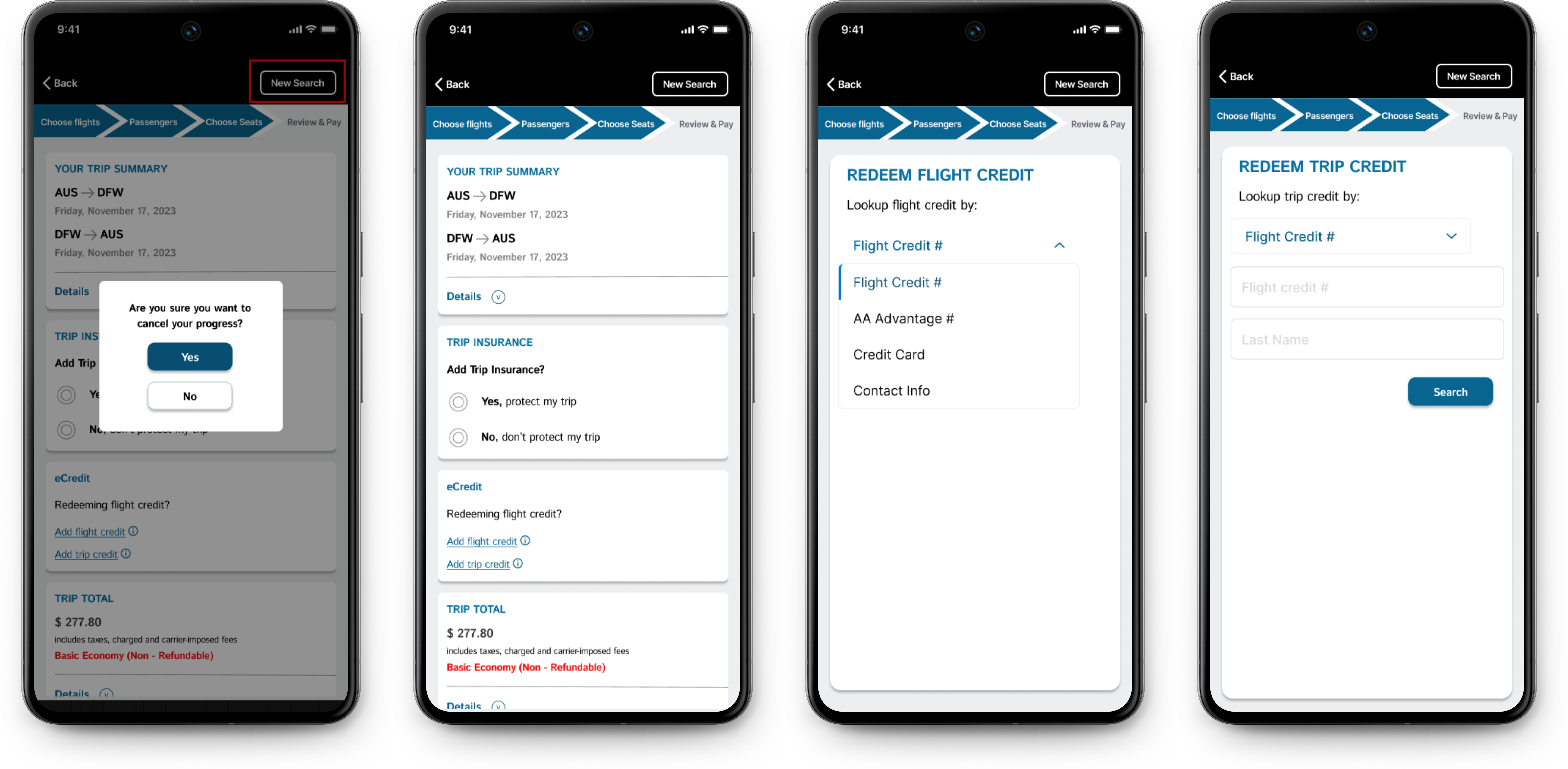
- To address the problem of users exiting the app to retrieve their flight
credits, discussed under 'Recognition rather than recall', I initially proposed
two
solutions - the option to save and return to progress, and the option to
retrieve flight credit
in-app.
During my cognitive walkthrough as an end user, I still struggled with the cognitive load of searching through my email for the flight credit. Also, as a software engineer, I understand the technical complexities related to price fluctuations. Incorporating a 'save and return to progress' option was not optimal.
I concluded with streamlining the solution to include a dedicated in-app screen for searching flight credits, which I consider the most optimal approach.
Reflection and Improvements
- This project definitely highlighted how much attention I paid to detail. Many times, I found myself fixating on the smallest of details like ensuring the right amount of white spaces, proper font alignment, and immersing myself in the roles of various end users.
- I learnt to embrace tradeoffs. Leveraging my technical skills, I was able to define middle grounds that catered to both a software engineer's perspective and a designer's vision. perspective, as well as a designer.
- Always start with sketches and lofi diagrams. Starting with this approach is crucial because creating hi-fi prototypes can be complex, and it's more efficient to explore creativity through sketches first. This way, I can avoid investing too much time in high-fidelity work that might require significant revisions
- For the redesign, I had another idea to implement an infinity progress bar extending beyond a single screen. This will be optimal for a flow where all the steps exceed the width of the mobile phone.
- Also, substituting words in the progress bar with icons will enhance cleanliness and compactness.